Let me begin with this statement, marketing is all about “stickiness”. My job and the job of however I am marketing my product, is to ensure that I hit home with a message about who my product is or more importantly who my product wants to be. A lot of self-congratulating veterans in the Veterans of Foreign Wars can’t stop raving about “product placement” in Budweiser’s “A Hero’s Welcome” Super Bowl commercial. For them, the VFW did an amazing job getting itself out there and into the forefront of American people. To them this commercial was a success.
I woke up this morning to the litany of self praise and decided, to review this commercial, because I admit, it was an enjoyable commercial, but I didn’t remember the VFW being in it.
So I decided to go through and pick out every point at which the VFW was shown:
Notice her in her service cap? Sure, now you do, because you’re looking for it, but this clip lasts for less than a second, which means you actually didn’t see it during the commercial.
If you’re looking for the VFW you’ll find it. Although, let’s be honest, this would be good placement if there was a follow up that panned to show the VFW comrade in the grey jacket. Since there isn’t, this barely counts as VFW product placement.
I’ll assume that these individuals in white shirts are part of the VFW color guard, although since one is in a beret, it could be another color guard unit, or a multi unit color guard.
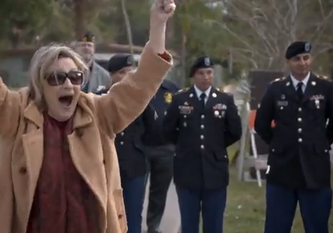
Is the guy with the VFW cap bored or standing there respectfully? Who would you rather see in the crowd if you returned from war, him in the background, or the woman who is excited to see you? (personally I’d rather shake hands with those soldiers behind her… yes I realize that she turns out to be his mom).
The closest the VFW got to branding, but they got the wrong side of his cover. Sure you and I know that he was the Post Commander of a VFW Post, but that’s because you and I are already in the VFW. More to the point, since this is the best VFW product placement in the whole commercial, let’s go a little bit more in depth about what is wrong with it. If the joy that individuals in the VFW are getting out of this superb commercial is the fact that it has successfully branded the VFW in the minds of veterans, specifically younger veterans, you are 100% correct. The VFW in this one shot branded itself as the place of “gray hairs”, well intentioned “gray hairs”, but old men none the less. If the joy that individuals are feeling with this commercial is that the VFW has branded itself in such a way as to make itself more attractive to younger veterans…. Well… let’s just be glad that the shot wasn’t of a smoke filled VFW bar surrounded by old men telling war stories.
Here’s the second best product placement of the VFW in the commercial. Allow me to explain one common part of marketing, when displaying your logo it needs to be front and center, or it needs to be reinforced by something else in the picture. You and I know that mid-right on the sign is the VFW’s logo, but to everyone else, their eyes were drawn to the welcome home sign that is covering part of the VFW logo. More importantly, if I am to display just a logo without words, then the logo needs to be easily identifiable by a broad spectrum of individuals. To have made this good product placement, the VFW logo would have had to been the object of the shot, and the VFW name would have had to be related the VFW logo.
So that’s it. There are no other shots in this 1 minute commercial for us to look at and review. Is it great that the VFW worked with Budweiser to make this happen for both the soldier returning home and the VFW? Sure. But let’s not kid ourselves into believing that the VFW successfully placed its brand before the eyes of the individuals that it has to attract to stay vibrant and alive: Iraq and Afghanistan veterans.
Want to keep up to date with The Inveterate Veteran? Make sure to subscribe and to like us on Facebook.


